


You’ve spent months perfecting your Shopify store, optimizing every product page, and crafting compelling content. But here’s the reality check – if your store isn’t mobile-ready for Google’s mobile-first world, you’re essentially invisible to 58% of all web traffic. That’s right, more than half of your potential customers might never find you.
As someone who’s navigated the ever-changing landscape of Shopify SEO for over eight years, I’ve witnessed firsthand how mobile-first indexing has transformed the e-commerce game. The shift isn’t just about having a mobile-friendly website anymore – it’s about understanding that Google now primarily uses your mobile site’s content for ranking and indexing. This fundamental change has made professional SEO services more crucial than ever for e-commerce success.
Whether you’re running a boutique fashion store, selling handcrafted jewelry, or building the next big dropshipping empire, understanding mobile-first indexing isn’t optional – it’s your ticket to staying competitive in today’s digital marketplace.
What Exactly Is Mobile-First Indexing and Why Should You Care?
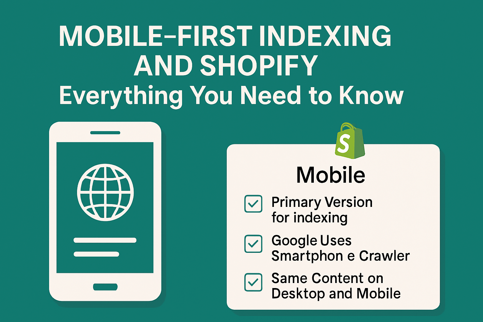
Mobile-first indexing represents Google’s paradigm shift from desktop-centric to mobile-centric website evaluation. Instead of crawling your desktop site first, Google’s bots now primarily examine your mobile version to determine rankings, understand content, and index your pages.
Here’s what this means for your Shopify store: Google treats your mobile site as the “real” version of your website. If your mobile experience is subpar, your desktop rankings suffer too. This isn’t just a technical SEO quirk – it’s a business-critical factor that directly impacts your bottom line.
The numbers tell the story clearly. According to Google’s own data, mobile searches account for over 60% of all organic search traffic. For e-commerce specifically, mobile commerce (m-commerce) generated $2.2 trillion in sales in 2023, representing 60% of all e-commerce transactions globally. If your Shopify store isn’t optimized for mobile-first indexing, you’re potentially losing thousands of dollars in revenue.
How Does Mobile-First Indexing Actually Work Behind the Scenes?
Think of Google’s crawlers as digital shoppers with smartphones. They visit your Shopify store exactly like a mobile customer would – tapping through your navigation, scrolling through product listings, and evaluating your checkout process. These bots analyze everything from your site’s loading speed to how easily customers can find your “Add to Cart” button on a 6-inch screen.
The indexing process prioritizes mobile user signals over desktop performance metrics. Page loading speed on mobile networks, touch-friendly navigation, readable text without zooming, and mobile-optimized images all factor into how Google perceives and ranks your store. This comprehensive evaluation extends beyond basic on page SEO elements to include mobile-specific user experience factors.
Google’s mobile-first approach also considers mobile-specific content consumption patterns. Mobile users typically scan rather than read, prefer shorter paragraphs, and expect immediate access to key information like pricing, availability, and shipping details. Your ecommerce SEO strategy must align with these behavioral patterns to succeed.
Why Shopify Stores Have a Natural Advantage in Mobile-First World
Shopify themes are built with responsive design as a foundation, giving store owners a significant head start in mobile optimization. Unlike custom-built websites that often struggle with mobile compatibility, Shopify’s infrastructure automatically adapts to different screen sizes and devices.
However, having a responsive theme doesn’t guarantee mobile-first indexing success. Many Shopify store owners make the mistake of assuming their mobile optimization work is complete once they choose a theme. The reality is more nuanced – while Shopify provides the foundation, achieving mobile-first excellence requires strategic optimization of content, images, navigation, and user experience elements.
Shopify’s built-in mobile optimization features include automatic image resizing, mobile-optimized checkout processes, and touch-friendly interface elements. These features provide a strong foundation for mobile-first indexing, but maximizing their potential requires understanding how to leverage them effectively within your overall SEO strategy.
What Are the Most Common Mobile-First Indexing Mistakes Killing Your Rankings?
The biggest mistake I see Shopify store owners make is treating mobile and desktop as separate entities. Your mobile site isn’t a simplified version of your desktop site – it’s your primary site in Google’s eyes. This fundamental misunderstanding leads to several critical errors that can devastate your search rankings.
Content parity issues top the list of mobile-first indexing killers. When your mobile site contains less content than your desktop version, Google only sees the reduced mobile content for indexing purposes. This commonly happens when store owners hide product descriptions, customer reviews, or detailed specifications on mobile to improve loading speed. While speed optimization is crucial, content reduction isn’t the solution.
Image optimization failures represent another major ranking killer. Many Shopify stores load full-resolution desktop images on mobile devices, creating painfully slow loading experiences. Google’s Core Web Vitals heavily penalize sites with poor loading performance, directly impacting your search visibility and user experience simultaneously.
Navigation complexity often destroys mobile user experience and search performance. Multi-level dropdown menus that work perfectly on desktop become unusable nightmares on mobile devices. When customers can’t easily find products or navigate your site structure, both conversion rates and search rankings suffer.
How Can You Audit Your Shopify Store for Mobile-First Readiness?
Conducting a comprehensive mobile-first audit requires examining your Shopify store from both technical and user experience perspectives. Start with Google’s Mobile-Friendly Test tool to identify basic compatibility issues, then dive deeper into performance metrics using Google PageSpeed Insights and Core Web Vitals data.
Your audit should evaluate page loading speeds across different mobile networks, not just high-speed WiFi connections. Many customers shop on 3G or slower connections, particularly in developing markets that represent significant growth opportunities for e-commerce businesses. Tools like GTmetrix and WebPageTest allow you to simulate various connection speeds and device types.
Content accessibility forms a crucial audit component often overlooked in standard SEO audit processes. Verify that all product information, customer reviews, shipping details, and contact information are easily accessible on mobile devices. Hidden or hard-to-find content won’t contribute to your search rankings under mobile-first indexing.
Navigation usability testing reveals critical user experience issues that impact both conversions and search performance. Walk through your entire customer journey on mobile – from initial product discovery through checkout completion. Document every friction point, confusing element, or frustrating interaction that could drive customers away.
What Technical Optimizations Boost Mobile-First Performance?
Image optimization stands as the single most impactful technical improvement for most Shopify stores. Implement WebP image formats where possible, utilize Shopify’s automatic image resizing features, and ensure all product images load quickly without sacrificing quality. Proper image alt tags also contribute to both accessibility and semantic SEO value.
Accelerated Mobile Pages (AMP) implementation can dramatically improve mobile loading speeds, though it requires careful consideration for e-commerce functionality. While AMP pages load incredibly fast, they may limit some interactive features crucial for online shopping experiences. Evaluate whether AMP makes sense for your specific product types and customer behavior patterns.
Structured data markup becomes even more critical under mobile-first indexing. Rich snippets help your products stand out in mobile search results where screen real estate is limited. Implement product schema markup for pricing, availability, reviews, and shipping information to maximize your search visibility and click-through rates.
Server response times significantly impact mobile user experience due to typically slower mobile network speeds. Optimize your Shopify store’s hosting performance, minimize server response times, and consider content delivery network (CDN) implementation to serve content from geographically closer servers to your customers.
How Should You Optimize Content for Mobile-First Success?
Content structure requires complete reimagining for mobile-first success. Desktop-optimized long-form content often becomes overwhelming and unusable on mobile devices. Break large content blocks into scannable sections, use descriptive subheadings, and prioritize the most important information at the top of each page.
Product descriptions need mobile-specific optimization that maintains SEO value while improving readability. Use bullet points for key features, include essential information in the first few lines, and structure content so mobile users can quickly find what they need without extensive scrolling. This approach serves both search engines and customers effectively.
Local SEO considerations become more important under mobile-first indexing since mobile users frequently search for nearby stores and immediate purchase options. Include location-specific information, store hours, and local contact details prominently on mobile pages, even if you primarily operate online.
User-generated content like customer reviews and Q&A sections provide valuable mobile-first indexing signals while building trust with potential customers. Ensure this content displays properly on mobile devices and contributes to your overall content strategy rather than cluttering the user experience.
What Role Does Page Speed Play in Mobile-First Rankings?
Page speed directly correlates with both search rankings and conversion rates, making it a critical success factor for mobile-first indexing. Google’s research shows that 53% of mobile users abandon sites that take longer than 3 seconds to load. For e-commerce sites, every second of delay can reduce conversions by up to 20%.
Core Web Vitals metrics – Largest Contentful Paint (LCP), First Input Delay (FID), and Cumulative Layout Shift (CLS) – now factor directly into search rankings. These metrics measure real user experience data, not just theoretical performance scores. Focus on achieving LCP under 2.5 seconds, FID under 100 milliseconds, and CLS under 0.1 for optimal performance.
Shopify’s built-in performance optimization tools provide a solid foundation, but additional optimization often delivers significant improvements. Minimize third-party app usage, optimize theme code, and regularly audit your site for performance bottlenecks that could impact mobile user experience.
Critical rendering path optimization ensures that above-the-fold content loads quickly on mobile devices. Prioritize loading essential page elements first, defer non-critical JavaScript, and minimize render-blocking resources that could delay initial page display.
How Do Navigation and User Experience Impact Mobile Rankings?
Navigation design fundamentally determines mobile user experience and search performance. Touch-friendly navigation elements, clear visual hierarchy, and intuitive user flows directly impact how both customers and search engines interact with your Shopify store.
Breadcrumb navigation becomes crucial for mobile user experience since users can’t rely on multiple browser tabs or complex menu structures. Clear breadcrumbs help users understand their location within your site structure and provide search engines with valuable hierarchy information for better indexing.
Search functionality takes on increased importance for mobile users who prefer finding specific products quickly rather than browsing through multiple category pages. Implement intelligent search features with auto-complete, typo tolerance, and relevant product suggestions to improve both user experience and internal link distribution.
Checkout process optimization impacts both conversion rates and search performance metrics. Streamlined mobile checkout reduces abandonment rates, improves user engagement signals, and contributes to positive user experience metrics that influence mobile-first rankings.
What Are the Future Implications of Mobile-First Indexing for E-commerce?
Voice search integration represents the next frontier in mobile-first optimization as smart speakers and voice assistants become more prevalent in shopping behavior. Optimize product descriptions and content for natural language queries and long-tail conversational keywords that reflect how people speak rather than type.
Progressive Web App (PWA) technology offers advanced mobile user experiences that combine the best aspects of mobile apps and websites. PWAs provide offline functionality, push notifications, and app-like navigation while maintaining SEO benefits that traditional mobile apps cannot offer.
Artificial intelligence and machine learning increasingly influence mobile-first rankings through Google’s RankBrain and other algorithmic updates. Focus on creating genuinely valuable user experiences rather than trying to manipulate specific ranking factors, as AI systems become better at identifying authentic quality signals.
Mobile commerce trends continue evolving toward more immersive and interactive experiences. Augmented reality product visualization, one-click purchasing, and social commerce integration will likely influence future mobile-first ranking factors as user expectations continue advancing.
Action Steps to Implement Mobile-First Optimization Today
Start with a comprehensive mobile audit using Google’s tools and real device testing across various smartphones and connection speeds. Document all issues and prioritize fixes based on impact on user experience and technical performance.
Optimize your most important pages first – homepage, top product pages, and category pages that drive the majority of your traffic and revenue. Focus on image compression, content structure, and navigation improvements that will deliver immediate performance benefits.
Implement structured data markup across your product catalog to maximize search visibility and click-through rates from mobile search results. This technical improvement provides both immediate and long-term SEO benefits with minimal ongoing maintenance requirements.
Monitor your mobile performance metrics regularly using Google Search Console, Analytics, and Core Web Vitals data. Set up alerts for performance degradation and establish regular review processes to catch issues before they impact your rankings or sales.
The mobile-first future isn’t coming – it’s already here. Your Shopify store’s success depends on embracing this reality and optimizing accordingly. The investment you make in mobile-first optimization today will pay dividends in improved search rankings, better user experience, and increased sales for years to come.
Remember, mobile-first indexing isn’t just about technical compliance – it’s about creating exceptional experiences for the growing majority of customers who shop on mobile devices. When you optimize for mobile-first success, you’re optimizing for business growth and long-term sustainability in the competitive e-commerce landscape.