


You’ve spent months perfecting your Shopify store, curating products, and crafting compelling descriptions. But here’s the harsh reality – if your mobile experience isn’t lightning-fast and seamless, you’re essentially turning away 54.8% of global website traffic that comes from mobile devices. That’s not just visitors; that’s potential revenue walking out your digital door.
As someone who’s been working in the trenches of Shopify SEO for nearly a decade, I’ve witnessed countless store owners make the same critical mistake: treating mobile optimization as an afterthought rather than the foundation of their technical SEO strategy. Google’s mobile-first indexing isn’t coming – it’s here, and it’s determining your search rankings right now.
Whether you’re running a boutique jewelry store, dropshipping the latest tech gadgets, or building the next big D2C brand, mobile optimization isn’t optional anymore. It’s the difference between thriving and merely surviving in today’s competitive ecommerce landscape.
Why Mobile Optimization Makes or Breaks Your Shopify Store’s Success
Mobile commerce isn’t just growing – it’s dominating. By 2024, mobile commerce accounts for 72.9% of all ecommerce sales, with the average mobile conversion rate sitting at 2.25% compared to desktop’s 4.81%. But here’s what most store owners miss: the gap isn’t about mobile users being less likely to buy; it’s about mobile experiences being poorly optimized.
When I conduct an SEO audit for Shopify stores, mobile performance issues consistently rank as the top conversion killer. A one-second delay in mobile load time can reduce conversions by 20%. Amazon discovered that every 100ms delay costs them 1% in sales – for a smaller ecommerce business, that percentage impact can be even more devastating.
Google’s Core Web Vitals have become the new battleground for search rankings. Your Largest Contentful Paint (LCP), First Input Delay (FID), and Cumulative Layout Shift (CLS) scores directly influence not just user experience but your organic visibility. Shopify stores that optimize for Core Web Vitals see an average 24% increase in mobile conversions and 13% improvement in search rankings.
Understanding Google’s Mobile-First Indexing Impact on Shopify Stores
Mobile-first indexing means Google predominantly uses your mobile site’s content for indexing and ranking. For Shopify store owners, this creates both challenges and opportunities. Unlike custom-built websites, Shopify’s responsive themes provide a solid foundation, but they often require fine-tuning to achieve optimal mobile performance.
The shift has particularly impacted ecommerce SEO strategies. Product pages that load slowly on mobile, images that don’t compress properly, or checkout processes that frustrate users now directly harm search visibility. I’ve seen stores lose 40% of their organic traffic simply because their mobile experience didn’t meet Google’s standards.
Your mobile site architecture must support both user experience and search engine crawling. This means optimizing navigation menus for thumb-friendly interaction, ensuring product images load progressively, and maintaining consistent schema markup across desktop and mobile versions.
How Fast Should Your Shopify Store Load on Mobile Devices
Speed isn’t just about user satisfaction – it’s about revenue. The ideal mobile loading time for ecommerce sites is under 3 seconds, but achieving sub-2-second load times puts you in the performance elite. Google’s data shows that as page load time increases from 1 to 3 seconds, bounce probability increases by 32%.
For Shopify stores specifically, several factors influence mobile speed. Theme choice plays a crucial role – lightweight themes like Dawn typically perform better than feature-heavy alternatives. Third-party apps can significantly impact performance; I regularly see stores with 15+ apps experiencing 5+ second load times.
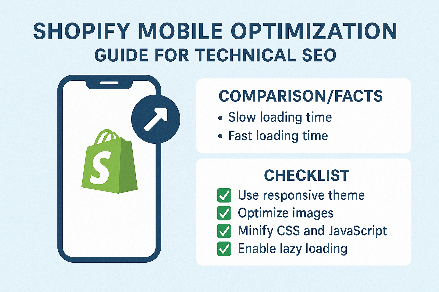
Your hosting infrastructure matters too. Shopify’s CDN is robust, but optimizing your assets for their system requires strategic thinking. Compress images using WebP format when possible, minify CSS and JavaScript, and leverage Shopify’s built-in lazy loading features. These optimizations typically improve load times by 30-50%.
Which Core Web Vitals Matter Most for Shopify Mobile Performance
Core Web Vitals aren’t abstract metrics – they’re direct measurements of user frustration or satisfaction. For Shopify stores, Largest Contentful Paint (LCP) measures how quickly your main content loads. Mobile LCP should be under 2.5 seconds, but top-performing stores achieve sub-1.8-second LCP scores.
Cumulative Layout Shift (CLS) is particularly challenging for ecommerce sites. Product images, price updates, and dynamic content can cause unexpected layout shifts that frustrate users and harm rankings. Maintain a CLS score below 0.1 by defining dimensions for all images, reserving space for dynamic content, and avoiding inserting content above existing elements.
First Input Delay (FID) measures interactivity. On mobile devices with limited processing power, heavy JavaScript can create significant delays. Shopify’s theme architecture helps, but custom code and third-party apps often introduce performance bottlenecks. Aim for FID under 100ms to ensure smooth user interactions.
What Mobile-First Design Principles Work Best for Shopify Themes
Mobile-first design isn’t about shrinking desktop layouts – it’s about reimagining the entire user experience for thumb navigation and smaller screens. Start with your product pages, as they’re typically your highest-traffic, highest-converting pages. Product images should be optimized for mobile viewing with zoom functionality that doesn’t require pinching.
Navigation becomes critical on mobile. Implement sticky headers for easy access to search and cart functions, but keep them minimal to preserve screen real estate. Breadcrumb navigation helps users understand their location within your store hierarchy, particularly important for category browsing on mobile devices.
Your checkout process deserves special attention in mobile-first design. Shopify’s checkout is already mobile-optimized, but customizations can break mobile functionality. Test every step of your checkout process on actual devices, not just browser simulators. Consider implementing guest checkout options and multiple payment methods to reduce friction.
How to Optimize Shopify Images for Mobile Performance
Images often account for 60-70% of a webpage’s total size, making them the biggest opportunity for mobile optimization. Shopify’s responsive image system automatically serves appropriately sized images based on device and screen resolution, but you need to provide high-quality source images and implement best practices.
Use Shopify’s image transformation parameters to serve optimized versions. The &width= parameter allows you to specify exact dimensions, while format parameters like &format=webp can reduce file sizes by 25-35% compared to JPEG. Always provide alt text not just for accessibility but for semantic SEO benefits.
Implement lazy loading strategically. While Shopify themes include native lazy loading, you can optimize further by prioritizing above-the-fold images and deferring below-the-fold content. Product galleries should load the first image immediately while lazy-loading subsequent images to maintain perceived performance.
Why Page Speed Optimization Requires a Mobile-First Approach
Traditional speed optimization focuses on overall page weight and server response times, but mobile optimization requires understanding device limitations and network constraints. Mobile processors have less power, mobile networks have higher latency, and mobile users have less patience.
Your optimization strategy should prioritize critical rendering path improvements. This means inlining critical CSS, deferring non-essential JavaScript, and using resource hints like dns-prefetch and preload strategically. For Shopify stores, this often means customizing theme code to achieve optimal performance.
Third-party scripts deserve special scrutiny in mobile environments. Analytics codes, chat widgets, and review platforms can significantly impact mobile performance. Implement these tools asynchronously and consider using tag managers to control loading priorities. Some apps offer mobile-specific implementations that can improve performance.
What Technical SEO Elements Need Mobile-Specific Attention
On Page SEO elements require mobile-specific considerations. Title tags should be concise enough to display properly on mobile search results, typically under 50 characters for full visibility. Meta descriptions need to be compelling in shorter formats, as mobile results show fewer characters.
Schema markup becomes more critical on mobile because rich snippets occupy more relative screen space in mobile search results. Implement product schema, review schema, and breadcrumb markup to maximize your search result visibility. Mobile users rely heavily on visual cues, making rich snippets essential for click-through rates.
Internal linking structure needs mobile optimization too. Navigation menus that work well on desktop can become unusable on mobile. Implement collapsible menu systems and ensure important category pages are accessible within two taps from your homepage.
How to Test and Measure Mobile Performance Effectively
Testing mobile performance requires tools that simulate real-world conditions, not just desktop tools with mobile viewports. Google’s PageSpeed Insights provides both lab and field data, but tools like GTmetrix, WebPageTest, and Chrome DevTools offer more detailed insights for optimization.
Real User Monitoring (RUM) data provides the most accurate picture of your mobile performance. Google Search Console’s Core Web Vitals report shows how real users experience your site, broken down by mobile and desktop. This data should guide your optimization priorities.
Device testing remains irreplaceable. Different devices, browsers, and network conditions create varying user experiences. Test your store on actual devices across different price points and manufacturers. Budget Android devices often reveal performance issues invisible on high-end devices.
Which Shopify Apps Impact Mobile Performance Most
App selection dramatically influences mobile performance, and many store owners unknowingly install performance killers. Review and rating apps often load external resources that slow mobile loading. Social media widgets and live chat tools can add significant JavaScript overhead.
Email capture popups deserve special consideration on mobile. While effective for conversions, poorly implemented popups can harm Core Web Vitals scores and user experience. Choose apps that offer mobile-optimized implementations and avoid those that block content before it loads.
Monitor your app performance regularly. Shopify’s built-in analytics show page load times, but third-party tools like Pingdom or New Relic can provide app-specific performance data. Remove or replace apps that consistently impact mobile performance, even if they provide useful functionality.
What Mobile User Experience Factors Influence SEO Rankings
Google’s algorithm considers user experience signals when ranking pages, and mobile experience carries significant weight. High bounce rates, low time on site, and poor engagement metrics can indicate mobile usability issues that harm rankings.
Mobile-friendly navigation influences both user experience and SEO. Users should access key pages within three taps, and your navigation should be consistent across your site. Implement search functionality prominently, as mobile users often prefer searching to browsing.
Form optimization becomes crucial for lead generation and checkout processes. Mobile forms should use appropriate input types, minimize required fields, and provide clear error messaging. Poor form experiences directly correlate with higher abandonment rates and lower conversion signals.
How Local SEO Integrates with Mobile Optimization for Shopify Stores
Local SEO takes on new importance in mobile contexts because mobile searches are three times more likely to have local intent. Even if you’re an online-only store, location-based optimization can improve mobile visibility for “near me” searches and local product queries.
Implement local business schema markup if you have physical locations or offer local delivery. Google My Business integration becomes more valuable as mobile users frequently use map-based search results. Even ecommerce-only businesses benefit from location signals in their SEO strategy.
Mobile users often search for products with immediate purchase intent. Optimize for local product searches by including location-relevant keywords in your product descriptions and implementing location-specific landing pages when appropriate.
What Common Mobile Optimization Mistakes Hurt Shopify Stores
The biggest mistake I see is assuming Shopify’s responsive themes automatically create optimal mobile experiences. While Shopify provides a strong foundation, customizations and app installations often break mobile functionality. Regular mobile testing prevents these issues from accumulating.
Ignoring mobile-specific SEO elements costs rankings and traffic. Many store owners optimize titles and descriptions for desktop search results, not realizing mobile results display differently. Mobile-first content creation should be standard practice.
Over-optimization can hurt mobile performance. Adding too many SEO services elements, excessive internal links, or heavy schema markup can slow mobile loading. Balance SEO benefits with performance requirements, prioritizing user experience over theoretical SEO gains.
Your Mobile Optimization Action Plan for Immediate Results
Start with a comprehensive mobile audit of your current performance. Use Google’s Mobile-Friendly Test and PageSpeed Insights to establish baseline metrics. Document current Core Web Vitals scores and mobile usability issues.
Prioritize quick wins first: compress images, enable Shopify’s native lazy loading, and remove unused apps. These changes typically improve mobile performance immediately and provide foundation for advanced optimizations.
Create a mobile-first content strategy. Review your product descriptions, category pages, and blog content for mobile readability. Implement shorter paragraphs, descriptive headings, and mobile-friendly formatting that enhances both user experience and search visibility.
Mobile optimization isn’t a one-time task – it’s an ongoing commitment to providing exceptional user experiences that convert visitors into customers. The stores that embrace mobile-first optimization today will dominate tomorrow’s search results and capture the growing mobile commerce opportunity.
Remember, every second you save in mobile load time and every friction point you remove from the mobile experience directly impacts your bottom line. Your mobile users aren’t just browsing – they’re ready to buy, and your mobile optimization determines whether they buy from you or your competitor.